If a few years ago nobody knew what is a smartwatch or considered buying one, now, they became quite popular and there is a quite large variety to choose from, each offering something unique and because the concept of smartwatch isn’t yet clearly defined it may be hard figuring out what’s the best choice for you.
A few months ago we reviewed what we considered to be the best smartwatch from the overall point of view, the Pebble Steel. It had a design similar to a classy ‘non-smart’ watch, a long battery life, a lot of features and a large app library.
Now, Pebble has released a new Pebble Watch, the Time Steel, which is an upgrade to the Pebble Time. The original Pebble Watch was pretty awesome and its direct successor, the Pebble Time got “smarter”, so what does the Pebble Time Steel has to offer?
Well, it is pretty much the same watch, but with a more luxury design. This isn’t a bad thing at all, smartwatches were considered toys for a while and only recently did they become more fashionable (Pebble Steel being the first from Pebble to achieve this).
But, will the new design and the same specs as Pebble Time be able to give the Pebble Time Steel the title of the best smartwatch on the market. Let’s have a look.
Design
If Pebble Time was all about functionality, Pebble Time Steel focuses on looks, while retaining the functionality. This isn’t something new, Pebble has released a Steel version of Pebble Watch before.
The original Steel was metallic, with soft angles and although a bit chunky, it did look like an actual watch, while Pebble Time always felt a little toy-like with its silicone straps and plastic shell.
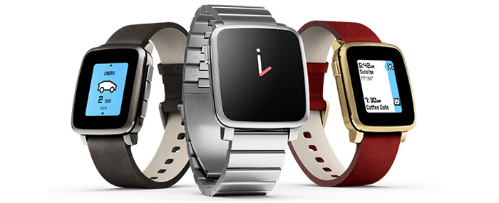
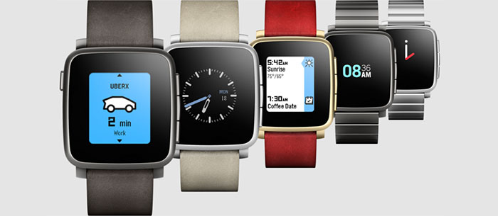
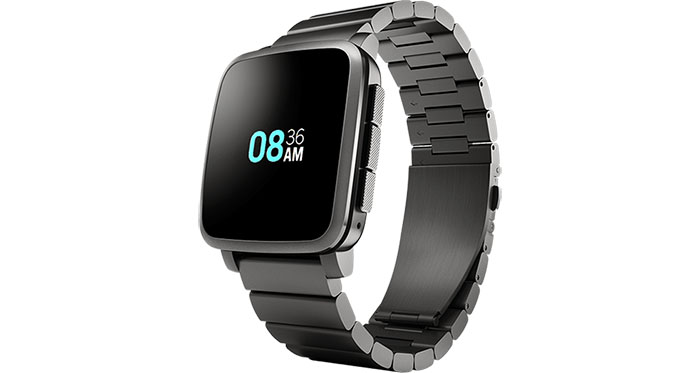
Time Steel, on the other hand is a lot softer than Pebble Steel, with a slightly curvier case that feels solid and well-made (you can easily have it mistaken for an Apple Watch), it’s metallic shell is made from marine-grade stainless steel (comes in black, gold and silver finishes) and overall looks a lot more luxurious than its predecessor .
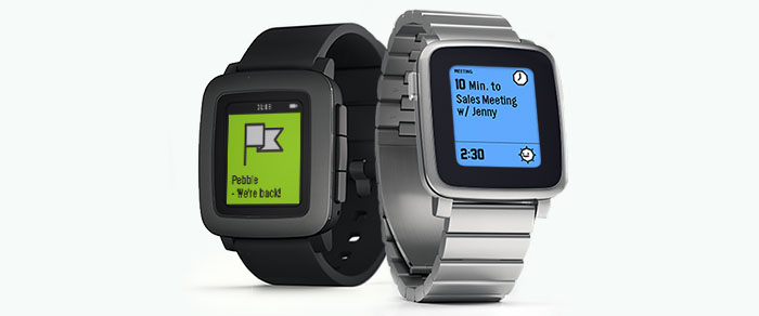
Complementing the metallic body, you can go with either a stainless steel strap (black, silver, gold) or with a leather strap (silver, red, beige). Both the leather and the steel straps feel comfortable on the wrist and are really easy to replace.
Every element of the Time Steel’s design looks good and is well placed, but there is one major flaw: the bezel. It is huge, even bigger than the one on the Pebble Time, making the display look so much smaller.
The reason behind this is that Pebble wants to keep the same resolution so that all the apps from the original Pebble will fit just right. It is understandable to some degree as any improvement to resolution will decrease the battery life, but still it doesn’t do it justice, as there are already better display options on the market and makes the Pebble Time Steel less desirable than it could have been.
The battery is already great and a decrease of one or two days would have been a great compromise for a bigger display. Still, you can mask this issue by using a black watch face, therefore matching the colour of the bezels. It’s obviously not the solution most of us would want but it does help a little.
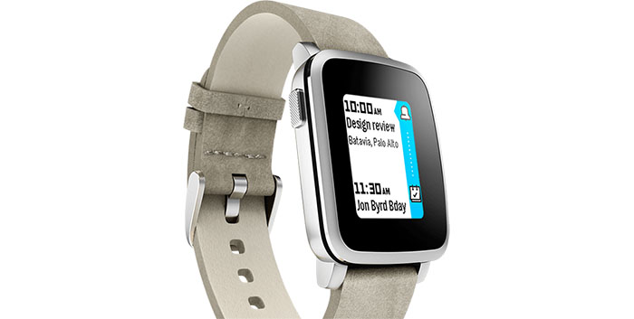
But let’s get back to the good stuff. The smartwatch is water resistant and you can submerge it underwater for up to 100 feet, but remember that the leather straps will get deteriorated pretty fast.
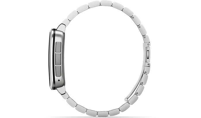
Pebble does not have a touchscreen, so the only way to interact with it is through its side buttons. On the right side there is the up, activate and down buttons, and on the opposite side rests the power button. Buttons feel more solid and are significantly less stiff to press than the ones on Pebble Time, especially thanks to the textured surface that further adds to the watch’s flair.
The microphone is still located underneath the three buttons, the usual charging pins are on the rear and you can use the magnetic charger from the Pebble Time to power up the Time Steel.
In the end the Pebble Time Steel is an attempt to break out of its ‘geek phase’ and just like the Pebble Steel (a smartwatch we enjoyed very much), it managed to achieve a simple and discreet design, making it fitted for most occasions.
If the Pebble Steel was focused mainly to the male audience, the Time Steel managed to achieve a unisex feel, so it fits perfectly on a smaller wrist as well as on a thicker one.
Display
The Pebble Time Steel features the same 1.25 inches colour e-paper display, with a resolution of 144x168p as found on the Pebble Time and is now protected by Gorilla Glass 3.
It is a very low power consumption display, which unfortunately isn’t particularly sharp and is less vibrant than your typical AMOLED or LCD displays found on other smartwatches. The display has 64 colours, that aren’t rich or vivid and their sole raison d’etre is to take the Pebble smartwatches out of the monochrome world.
But there are some good news. The display performs great when viewed under direct sunlight, it is even better than many other LCD screens found on the competition and it has a backlight that can be activated for low-lit indoors areas or for night time viewing.
The screen also has surprisingly good viewing angles, the display is closer to the surface of the glass, further enhancing text reading and no more bezel shadows on the screen.
You know those little delays that you have to experience before the display switches on? Well, the Time Steel has solved this problem by keeping the display on, always showing the time (or any other app), just like a normal watch.
Because of this, it’s clear why Pebble didn’t use LCD or AMOLED technologies, because it would have taken away from its best feature, the battery.
Yes, the display may not be as impressive as the one on Apple Watch or on Android Wears, but what you gain is battery endurance and Pebble still remains one of the few smartwatch manufacturers that actually emphasizes on the watch part of the smartwatch.
Performance and Battery Life
The hardware behind the Pebble Time Steel is a 100 Mhz ARM Cortex M4 CPU, 64KB of RAM and a total internal memory of 16MB, which is gravely limited, but because the apps aren’t really complex, it’s hard to hit any storage limit despite installing a bunch of apps.
There are also four sensors: an Accelerometer, a Magnetometer, an Ambient Light Sensor and a Gyrometer.
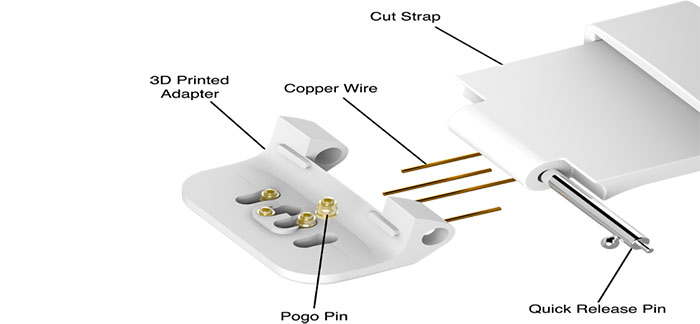
Because the list of sensors is pretty limited, Pebble has announced unique hardware extensions for both the Pebble Time and Pebble Time Steel called Smartstraps, which allow developers to further enhance the watch’s capabilities or create new ones (including sensors, batteries, GPS, NFC and more) for both Time and Time Steel.
The Lithium-ion battery promises to deliver up to 10 days of use, instead of the seven days from Pebble Time. It goes without saying that the Pebble offers one of the best battery life performance.
Software
As usual, the Pebble’s interface is simple and straightforward, the first thing you have to do is pair it with your Android or Apple device (yes, it’s still compatible with both, although it works better with iOS), install the apps you need, try some watch faces and lastly you should configure the Timeline.
(UPDATE (01.24.2016): Back in October we tested the Pebble Time Steel with an iPhone 6 and it ran without problems and no disconnects. Afterwards, we paired the Time Steel with an OnePlus One, a Samsung Galaxy S5 and a Samsung Galaxy S6. We experienced occasional disconnects and there were some problems with a few apps (loading issues and some freezes). So, we tried the same tests with another Time Steel unit and surprisingly, there were no disconnects this time and all ran without problems. We used the new unit for about a month and no problems were noticed (another surprise was the fact that it disconnected a couple of times while paired with iOS). The conclusion is that the first unit was bugged (defective?) and it seems that Pebble Time Steel works great with Android, as well as with iOS. )
Not much has changed since Pebble Time, but there is better syncing with Android, you can now reply to some messages or texts, you can dismiss notifications and now the interface has two main areas, one for the menu, the other for the Timeline.
What the Timeline does is to deliver information at a given time, be it calendar events, calls or the weather (or anything you may have added in the configuration of the Timeline), both from the past or future in a simple, smooth stream. The Timeline works really great as long as you have properly configured which apps should appear and when.
There is also a Notification List (Pebble is really good at delivering notifications and not once did it felt intrusive) and some basic fitness tracking with apps like Misfit, Jawbone or Strava.
You can assign buttons (through Quick Launch) to let you jump from the watch face to a particular, favorite app, there is a new Quiet Time that makes sure you are undisturbed during certain periods of the day (like when you’re in a meeting) and a StandBy mode that disconnects you from the phone if the watch is stationary for more than 30 minutes and it reconnects the moment it senses movement.
But let’s not forget that just like any other Pebble Watch, it relies heavily on the connection to the phone through Bluetooth and it doesn’t do a lot on its own.
Note: The Pebble App Store covers the main apps (more than 8000 apps and watch faces available), but it isn’t as comprehensive as the Apple Watch App Store or Android Wear.
Conclusion
What Pebble Time Steel tried to do is get a better integration into the mainstream, it tried to create a superior, more mature smartwatch than the more toy-like Pebble Time while retaining everything its predecessor had and without adding much more.
And it did succeed to a certain degree. We saw the impact the Pebble Steel had, it was for the mature audience and even if it was black and white, it had everything a smartwatch should have, it was reliable, it was a good handset extension, without sacrificing the watch functions.
But Pebble Time Steel just doesn’t feel the same. Yes, the materials are more expensive and the unisex feel is a good thing, but it still is in the playful, geeky zone. This is just personal taste, some of you may like its design, some may not.
Still, in terms of functionality, it is a great smartwatch, it may not be as flashy as the Apple Watch, but it offers exactly what you need from a smartwatch (receiving notifications, reading and writing emails, browsing through music and some fitness applications).
There is a lot of potential in the future (Wristbands, Voice Control) and we hope that in future instalments the huge bezels will be a thing of the past. But in the meantime, the Pebble Time Steel remains a good alternative to more expensive smartwatches and it has the big advantage of a long battery life.

Mark is a graduate in Computer Science, having gathered valuable experience over the years working in IT as a programmer. Mark is also the main tech writer for MBReviews.com, covering not only his passion, the networking devices, but also other cool electronic gadgets that you may find useful for your every day life.

